Landing page design, the way a designer does it. And how to take the AI look out of yours.
The short version is on this page: ten fixes, in three minutes. Each one opens into a short chapter with live figures you can move and the numbers we use, when you want the why.
By Harvansh, Hairline UIUpdated 13 November 20263 min here · 9 chapters, 50 min in all
Ten fixes. Do these and most of the AI look is gone.
- 01Start from an idea, not a list of sectionsThe idea decides the hero, the colour and the ending, so the page feels designed rather than assembled.The idea comes first · 5 min
- 02Give each screen one thing to look at firstEverything the same size means nothing leads. Squint: one shape should hold.Hierarchy · 5 min
- 03Put everything on one gridText starts on two or three lines, nothing floats on a shadow, phones get their own layout.Grid and placement · 5 min
- 04Less space inside a group than between groupsEven gaps everywhere are the most common tell. Use steps of 4 px.Spacing · 5 min
- 05Fewer type sizes, a lighter headlineFour to six sizes from one ratio, a headline a size smaller and a weight lighter than the default, lines of 45 to 75 characters.Type · 4 min
- 06One colour that means one thingNot a violet glow on everything. Selected and hover states are a step of grey.Colour and light · 6 min
- 07Take away the boxes, shadows and glowSpace, type and one hairline do what cards in cards were doing.Surfaces and depth · 6 min
- 08Show the real productA dense, specific picture of it working, not a dashboard on a glowing card.Graphics and product UI · 6 min
- 09Move only what has a jobNot everything fading up. One motion that shows the product working.Motion · 6 min
- 10Cut every word a competitor could useNo unlock, elevate or seamless. Real numbers, a headline only you could write.Copy · 4 min
The long version, in 9 short chapters. About five minutes each, every figure live.
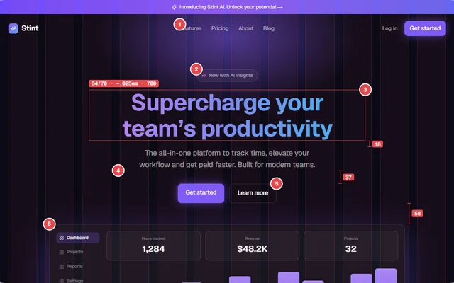 1 · 5 min · 5 figuresThe idea, and hierarchy.Where a designed page starts.
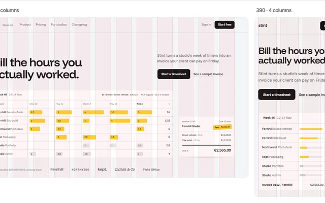 2 · 5 min · 6 figuresGrid and spacing.Where everything sits.
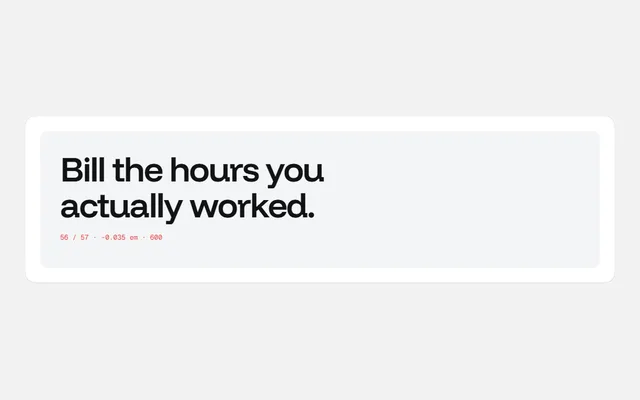 3 · 4 min · 4 figuresType.The part of the design people read.
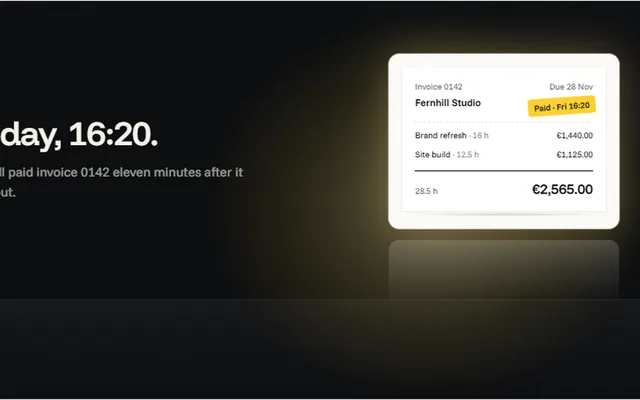 4 · 6 min · 7 figuresColour, light and depth.One colour, and no boxes for their own sake.
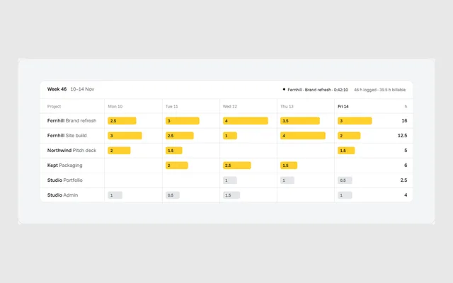 5 · 6 min · 7 figuresGraphics and motion.Show the product doing its job.
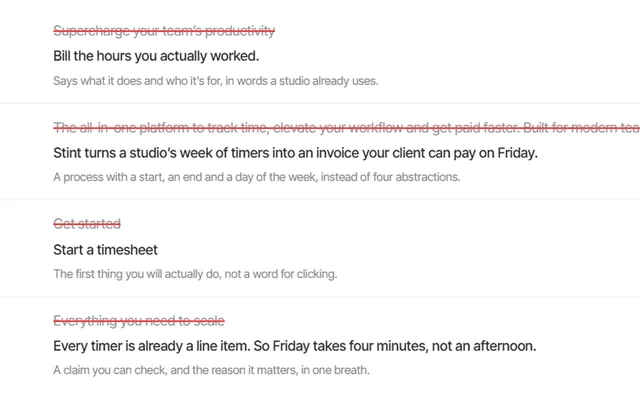 6 · 4 min · 6 figuresCopy and speed.Words only you could say, and taps that answer.
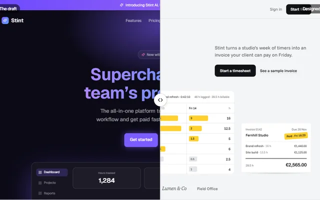 7 · 6 min · 5 figuresThe top of the page.Header, hero, proof, features and the demo.
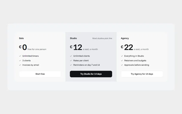 8 · 5 min · 6 figuresThe rest of the page.How it works, quotes, pricing, FAQ, the ending and phones.
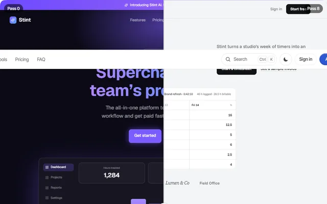 9 · 9 min · 2 figuresOne page, fixed.The teardown, the checklist and every number.
Start from a page that already does this. Or have us redesign yours.
Landing page templates
Every one designed from scratch around its own idea, checked against this guide, and ready to make yours in one content file. Next.js and Tailwind.
Landing page redesign
Send us your page. We design a new first screen and product pictures, fit the sections, and hand back a page you can ship.
The small interactions in this guide (rolling numbers, morphing labels) are free components in our library.
Further reading
- WCAG 2.2The accessibility standard behind the contrast and target sizes here.
- Web VitalsGoogle’s definitions of LCP, INP and CLS, and their thresholds.
- Practical TypographyMatthew Butterick on line length, sizes and spacing.
- Refactoring UIAdam Wathan and Steve Schoger on hierarchy, spacing and colour.
- Laws of UXJon Yablonski’s short guide to the psychology under interface rules.