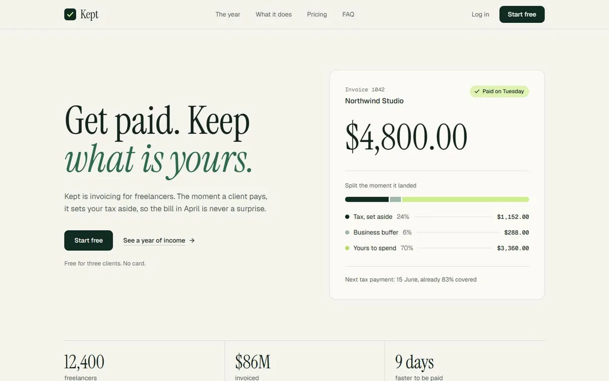
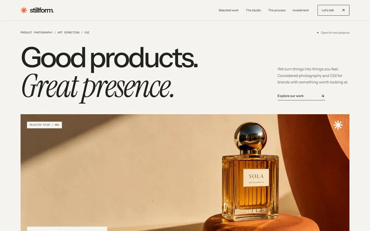
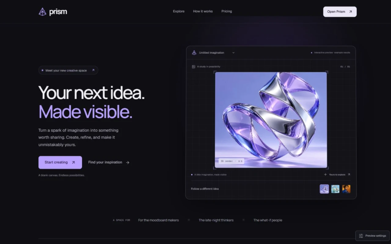
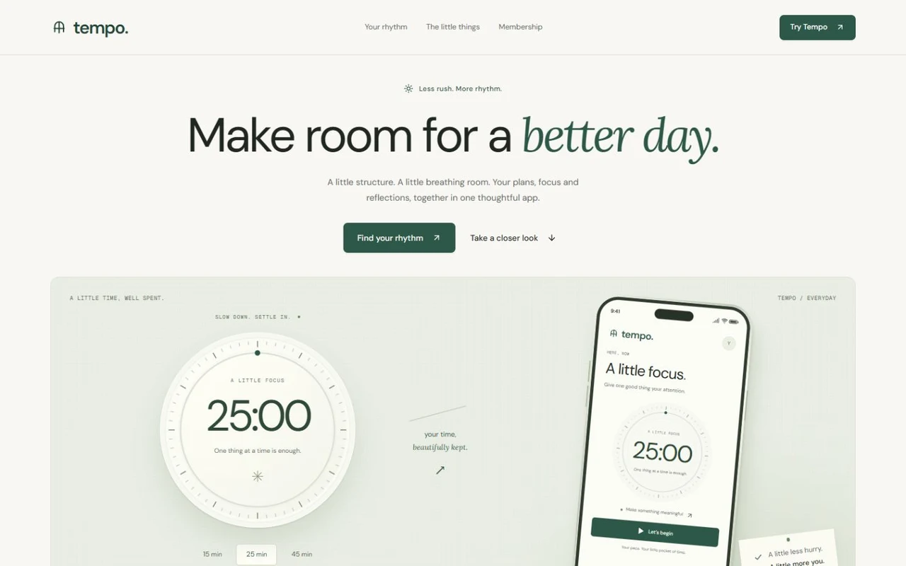
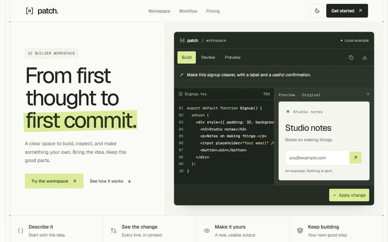
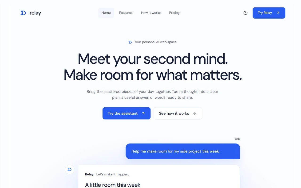
Shear: Motion-led cloud cost SaaS landing page template for Next.js.
- Next.js 15
- Tailwind CSS v4
- TypeScript
- 12 sections
- Dark
- No API keys
- Updated Oct 10, 2026

Overview
A complete, motion-first launch page with original positioning: Shear finds idle and oversized cloud resources and ships the fix as a pull request. Near-black frames open and close the page, mint marks every saving, and every figure, label and panel that changes morphs instead of swapping.
- Made for
- Developer tools, infrastructure and FinOps products, B2B SaaS launches that want a striking, motion-led first impression, Products with figures to prove: savings, speed, uptime, conversion
- Highlights
- Live glyph-field canvas that reacts to the cursor and pulses on every headline change
- Scroll-driven proof grid, drag-and-snap feature carousel and hover-to-open steps
- Hero email field that posts to your endpoint or opens your sign-up page
- Rolling prices, morphing labels, a pause control and full reduced-motion support
- The look
- Mona Sans throughout, using its width axis for motion, with Fragment Mono for figures. Near-black inset frames for the hero and footer, a white page with cool grey containers, and a single mint accent. Pill buttons carry a dark disc with the brand mark, whose halves slide along their cut on hover. No photography: product screens are light WebP images, and the hero art is a canvas.
Sections
- 01
Hero
Dark inset frame with a live glyph-field canvas (a river of figures falling along a cost curve), a headline whose last word morphs between five words, an email field wired to your endpoint or sign-up page, and a customer logo strip with a pause control.
- 02
Navigation
Full bar in the hero, a compact floating bar that marks the section you're reading, and a phone menu that grows out of the bar.
- 03
Proof
Five stats and a monthly bill chart in a bento grid whose outer columns spread out as you scroll; figures roll up and the chart draws once it lands.
- 04
Comparison
A raised dark column against two alternatives with row highlighting; phones switch between the alternatives instead of scrolling a long table.
- 05
Product carousel
Six wide feature cards with product screens (waste radar, rightsizing gauge, coverage ring, anomaly alert, unit costs, forecast), snap scrolling, drag, arrows and a progress hairline.
- 06
How it works
Three steps that widen on hover to reveal their screens: accounts connecting, findings ranked by cost and a merged pull request. A tap accordion on phones.
- 07
Teams
Four keyboard-accessible tabs with a thrown indicator, an autoplay fill, copy that slides with direction and a colour field that blends between palettes.
- 08
Why Shear
A Monday digest card over a quieter glyph river, beside four reasons on hairlines.
- 09
Customers
A staggered grid of quotes and people with a dark customer-result tile.
- 10
Pricing
Four plans with a monthly/yearly switch and rolling prices; buttons go to checkout, sign-up or an email to sales.
- 11
FAQ
An accordion beside a sticky intro; answers open to their real height and arrow keys move between questions.
- 12
Closing and footer
The glyph river again in ink on a light panel, then a dark footer whose giant wordmark slides back into line as it scrolls in.
Remove a section by deleting its line in app/page.tsx, or move the line to reorder.
Built with
Its motion comes from free components in our library, shipped in components/hairline/ so you can use them anywhere else on the page too.
- Number roll · Features, Proof, Teams, TestimonialsNumbers that change like an odometer: every digit rolls in the direction the number moved.
- Text morph · Signup formText that changes the way it should: shared letters slide over, new ones rise out of a blur, the width eases.
- FAQ accordion · FaqQuestions on hairlines that open like they mean it: the answer eases to its height, the plus folds into a minus.
- Logo marquee · HeroA quiet strip of logos that notices you: it eases to a stop on hover and the logo you point at stays bright.
- Pricing toggle · PricingMonthly or yearly: the thumb slides with a little give, and every price on the page rolls to its new amount.
Make it yours
Everything a visitor reads, and every destination, lives in site.config.ts. The palette is a handful of CSS variables, and the product screens are images you replace with your own at the same proportions.
| To change | Edit |
|---|---|
| Brand, copy, headline words, stats, plans, questions and destinations | site.config.ts |
| Where the hero email goes (endpoint, sign-up page or the plans) | site.config.ts → signup, lib/signup.ts |
| Palette: mint accent, ink frames, greys | app/globals.css |
| Fonts | app/layout.tsx |
| Product screens (sizes in the README) | public/images/ and site.config.ts |
| Section order | app/page.tsx |
Run it
$ npm install$ npm run devNode.js 20.9 or newer. No environment variables.
Before you go live
Replace the fictional brand, customers, quotes and figures. Set signup.endpoint or signup.url, each plan's checkout links and your sales email in site.config.ts. Connect your real product, billing and sign-up separately.
Specifications
- Framework
- Next.js 15 (App Router), React 19
- Language
- TypeScript
- Styling
- Tailwind CSS v4 with design tokens and component styles
- Fonts
- Mona Sans, Fragment Mono, self-hosted with next/font
- Dependencies
- next, react, react-dom, lucide-react
- Images
- Sixteen original product screens designed for the template and rendered at 2× as WebP, about 250 KB in all. The hero art is a canvas; the mark and the fictional customer logos are SVG.
- API keys and environment variables
- None
- Node.js
- 20.9 or newer
- Colour scheme
- Dark
- Responsive
- Desktop, tablet and phone
- Accessibility
- Skip link, visible focus, keyboard navigation, reduced motion
- Deploys to
- Vercel, Netlify, Cloudflare Pages or any Node host
- Codebase
- 64 source files, about 4,600 lines
- Last updated
- Oct 10, 2026
License
One license, no tiers. The full text ships as LICENSE.md in the download.
You can
- Use it for your own products
- Use it for any number of client projects
- Change the code and design however you like
- Deploy the result commercially
You can’t
- Resell or share the files as a template, theme or UI kit
- Publish the source as a template in a public repository
Questions
What do I get when I buy Shear?
The complete Shear project as a download: the Next.js app, its config file, a README with setup and customisation notes, and the license. The download link arrives right after checkout.
Can I use Shear for client projects?
Yes. One purchase covers your own products and any number of client projects, and you can change the code however you like. What you can’t do is resell or share the template files themselves as a template or UI kit.
Do I need API keys, a database or a backend?
No. It runs with npm install and npm run dev and deploys to Vercel, Netlify or Cloudflare Pages without any environment variables.
What should I change before I launch?
Replace the fictional brand, customers, quotes and figures. Set signup.endpoint or signup.url, each plan's checkout links and your sales email in site.config.ts. Connect your real product, billing and sign-up separately.
Do I need to know Next.js?
Basic React helps, but most changes are text edits in site.config.ts. The README walks through colours, fonts and section order.
How do updates work?
Updates to Shear are free. When a new version ships, download it again from the link in your order email.
Can I get a refund?
Yes. If Shear isn’t right for you, reply to your receipt within 14 days and you get your money back.
Should I buy all-access instead?
If you’ll use more than two templates, yes. All-access is $99 for all 21 templates, including Shear and every template added later. Three single templates would cost $117.
All-access
All 21 templates for $99.
Every template in the library, including Shear, and every one added later. Same license, free updates. Less than three single templates.